Starting with the emotional core
The first conversation we have about any cover project is not about colors or typefaces. It is about the book itself. What is the central tension? What emotion should linger after the last page? What is the one thing the cover must communicate above everything else?
That emotional core becomes the brief's anchor. Every subsequent decision — the image treatment, the typographic weight, the amount of negative space — is evaluated against it. A cover that looks beautiful but misrepresents the book's tone has failed at its primary function.
This is why we read before we design. Not summaries or jacket copy, but chapters. The visual argument must be earned.
Typography as the primary argument
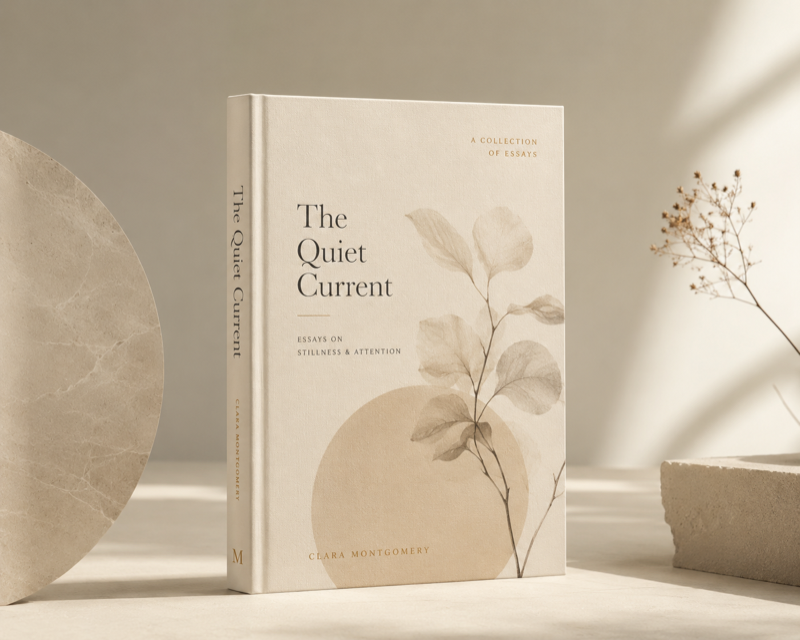
In most book categories, the title is the dominant visual element. It is not a label placed on top of an image — it is the primary design element around which everything else is composed. The typeface choice communicates genre, era, and attitude before the reader has parsed a single letter's meaning.
At Grafizm, we approach typographic selection with the same deliberateness as a compositor's proof. Optical size, tracking, weight contrast between title and author name, the relationship between type and any imagery — each variable is tested against the brief's emotional requirement, not against convention.
We resist the convenience of familiar typefaces chosen for genre signaling. The goal is a cover that feels exactly right for this book, not one that reads "this kind of book."
Composition and focal hierarchy
The cover is a three-dimensional object that will be seen at radically different sizes: thumbnail in a search result, spine on a shelf, full-bleed in a catalog spread. Composition must hold across all three.
We design at 100% and at 10%. Elements that work at full size sometimes collapse at thumbnail — a detail-rich illustration that loses coherence, a title at a weight that becomes illegible small. Where necessary, we design separate thumbnail treatments, but the goal is always a composition that reads at every scale.
Focal hierarchy — what the eye reads first, second, third — is mapped explicitly. A cover that presents everything at the same visual weight presents nothing.
Color as tone, not decoration
Color direction is set last, after typography and composition are resolved. This is intentional. Color chosen before the structural decisions are made tends to become decorative rather than purposeful — a mood board rather than a visual argument.
The color palette is tested against the emotional core brief. A novel about isolation set in winter in a warm amber palette creates cognitive dissonance for the reader before they have registered why. The palette earns its place by reinforcing the book's specific emotional register.
We deliver color specifications in RGB, CMYK, and Pantone where relevant. Covers going to print receive physical proofing guidance where the production schedule permits.
From concept to final resolution
Our cover process runs from brief to three concepts, each resolving the visual problem from a different structural angle. This is not a process of offering variations — each concept is a fully considered answer to the brief, capable of being taken forward.
Client selection is followed by two rounds of focused refinement. The final deliverable is a print-ready file with embedded fonts, color profiles, and a companion style guide noting the typefaces, color values, and any production-specific requirements.
We have worked with independent authors, small press publishers, and design directors on full catalog refreshes. The brief process is the same regardless of scale.