The philosophy of reduction
Reduction in logo design is not an aesthetic preference — it is a structural requirement. A mark carries the full weight of a brand's identity across every medium it touches: embossed on stationery, reversed white on a dark background, printed at 8mm on a product label, displayed at two meters on a trade stand.
Complexity collapses under these conditions. Detail that looks refined at presentation scale becomes noise at stamp size. The mark that survives every context is the one that has been reduced to only what cannot be removed.
At Grafizm, the first phase of any mark project is a reduction audit: identifying which elements are structural and which are decorative. What remains after that audit is the mark.
Wordmark geometry: every proportion deliberate
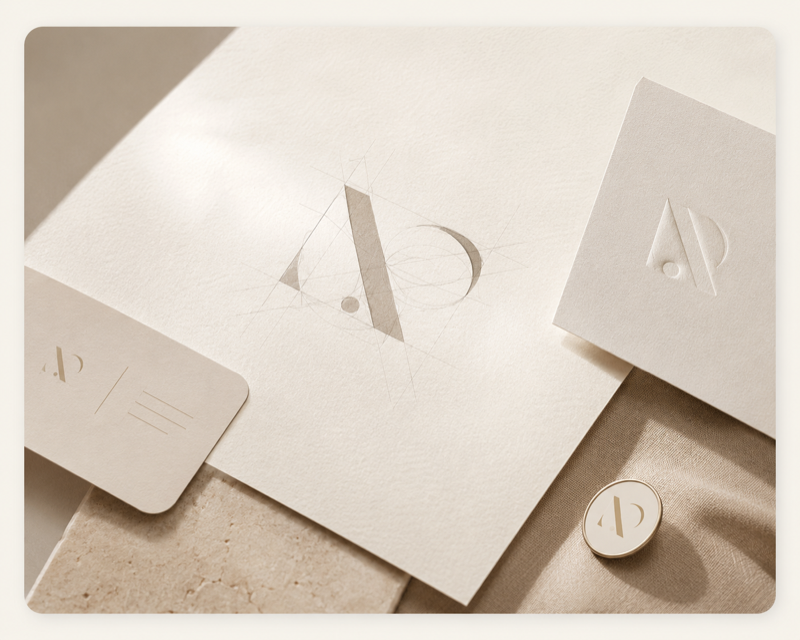
In a wordmark, the letterforms do the structural work. But letterforms from even the best typefaces require optical adjustment before they function as a mark rather than as set type. Letterspacing at logo scale is different from text spacing. Certain letter pairs create optical gaps or collisions that go unnoticed in running text but are conspicuous in a mark.
We work directly in vector from the outset, adjusting individual letterform proportions, refining optical spacing, and where necessary modifying specific characters for visual consistency across the mark. The goal is a wordmark where every proportion feels inevitable — where nothing could be moved without the whole becoming slightly wrong.
This level of refinement is not visible to most viewers. It is felt.
Testing across scale and context
Every mark we produce is tested across a structured set of contexts before it is considered resolved: minimum reproduction size (the point at which legibility breaks down), reversed on dark backgrounds, single-color reproduction, emboss simulation, and in-use mockups across the primary brand touchpoints.
Scale testing frequently surfaces problems invisible at standard working size. A stroke weight that reads as elegant at logo size becomes a filled-in gap at 8mm. An intricate terminal becomes a smudge at small scale. These are not edge cases — they are the standard conditions under which a brand mark operates.
We do not present a mark as resolved until it has passed every context in the testing matrix.
Weight, spacing, and optical correction
Optical correction is the invisible craft of logo design. Two lines of identical mathematical weight read as unequal because of the way the human visual system processes horizontal versus vertical strokes. Corners need to be slightly extended to read as sharp at distance. Circular forms need to be slightly enlarged to appear optically equal in size to square forms.
These corrections are not visible — they are what makes a mark look right when they are made, and wrong when they are not. A mark that looks slightly off without an obvious reason usually has uncorrected optical issues at the character level.
At Grafizm, optical correction is part of the standard refinement process, not an optional add-on.
From mark to brand asset
A completed mark is delivered as a structured asset package: primary lockup, stacked lockup where applicable, icon-only version, reversed variants, and a monochrome version. File formats include SVG, AI, EPS, and PNG at multiple resolutions.
The asset package includes a one-page mark usage guide noting minimum sizes, clear space requirements, approved backgrounds, and prohibited modifications. This document is not a gesture toward brand governance — it is the practical specification that will determine whether the mark is used correctly five years from now.
For clients requiring a full brand system developed from the mark, we scope that as a separate project phase.