What a system means — and what it doesn't
A brand system is often misunderstood as a constraint document — a set of rules limiting what can be done. In practice, a well-constructed system does the opposite. It provides the framework within which creative decisions can be made quickly, consistently, and by people who were not involved in designing the system.
A system is working correctly when a designer who had no involvement in the original brand development can produce a new brand touchpoint — a social post, a presentation deck, an event banner — that looks unmistakably on-brand. A system is failing when every new application requires a judgment call that only the original designer can make.
At Grafizm, we test every system against this condition before delivery: can someone else use this?
Typography scale and hierarchy
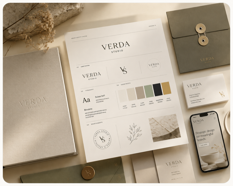
The typography system is the most used and most abused element of any brand identity. It comprises: the primary typeface or family, the size scale, the weight system, the spacing conventions, and the hierarchy rules — which level of information uses which treatment.
We specify typography systems as structured decisions rather than visual examples. A system that says "use this size for headings" will be applied inconsistently as soon as the designer encounters a heading slightly different from the example. A system that says "headings use the scale's 3rd level, weight 600, tracking -0.02em, line-height 1.1" can be applied correctly by anyone.
The scale itself is derived mathematically from a base size and ratio — typically a major third or perfect fourth — so that every level in the hierarchy has a logical relationship to every other level.
Color architecture
Color systems fail at the same point: too many colors, no rules about when to use them. The result is a palette that looks cohesive in presentation and chaotic in production.
A functional color architecture distinguishes between structural colors (background, text, border) and accent colors (CTAs, highlights, interactive states), establishes usage rules for each, and defines what happens in dark contexts and at minimum contrast ratios.
We specify every color in HEX, RGB, CMYK, and the nearest Pantone reference. Contrast ratios against the system's standard backgrounds are documented to confirm WCAG AA compliance as a baseline.
Layout principles and grid logic
Layout principles translate a brand's visual character into spatial decisions: how much white space, what margin proportions, how images and text relate. A brand communicating precision and restraint needs different spatial logic than one communicating energy and abundance.
The grid we specify is not a rigid framework but a flexible system: the base unit, the column structure for the most common canvas sizes, the margins, and the rules for how elements relate to the grid. A good grid is one the designer stops consciously following after a short period — it becomes the intuitive organizational structure of every layout.
We also establish image and illustration treatment standards: how photography is cropped, how it interacts with type, whether a specific treatment (duotone, desaturation, overlay) is applied, and what image content is appropriate within the system.
Cross-medium consistency
The final test of a brand system is cross-medium: does print feel like digital? Does the website feel like the packaging? Inconsistency across media is where brand systems most commonly fail, because each medium has different technical constraints and is often handled by different teams or suppliers.
The system documentation we deliver is written for cross-medium use. Where print and digital specify the same color differently, we document both. Where a typographic treatment works in one medium but requires modification in another, we document the modification rule.
We also provide a production notes section: technical specifications for common print processes, web font loading instructions, and any medium-specific constraints the implementing team needs to know.