The visual language of live events
Live events share a structural requirement that most other design categories do not: they are time-bound. The poster must communicate what, when, and where while also creating desire — making the reader want to be there before they have fully processed the information.
These two functions are in tension. Information design pulls toward clarity and comprehension. Desire-creation pulls toward atmosphere and emotional register. The poster that resolves both functions is doing the hardest kind of design work.
At Grafizm, the brief process for event design starts with atmosphere: what should someone feel looking at this poster? Urgency? Prestige? Energy? Intimacy? The answer shapes every design decision that follows.
Hero poster: anchoring the campaign
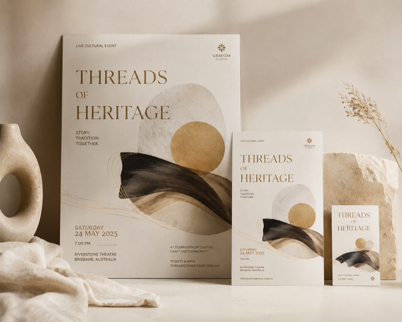
The hero poster is the visual anchor of the campaign — the format at which the design is resolved at its fullest and most considered. All other formats are derived from it, not designed independently.
This matters because campaigns that design each format separately tend to lose coherence. The social cut feels like it is advertising a different event. The print version and the digital banner feel unrelated. Coherence across a campaign requires a clear visual origin point from which everything else inherits.
The hero format is resolved first, at full size, before any scaling work begins. Once the visual language of the hero is approved — the typographic system, the color and image treatment, the compositional logic — it becomes the specification for every derived format.
Format scaling: from billboard to social
Format scaling is not resizing. An A0 poster has a very different viewing condition from a 1080×1080 Instagram square — different viewing distance, different context, different amount of available attention. What works at one scale needs to be actively redesigned for the other, not shrunk.
Typical event campaign deliverables include: hero print format (A1, A0, or custom), secondary print formats (A3, A4 flyer, 6-sheet), digital display formats, and social media cuts (feed post, story format, event cover). Each is adapted from the hero's visual language while being specifically designed for its viewing context.
Where the production schedule permits, we present format proofs in realistic mockups — a poster in a physical space, social formats in a device frame — rather than flat artwork on white.
Typography in event design
Event posters live or die by their typography. The name of the act, the date, the venue — these are not secondary information to be accommodated within a design. They are the design.
The typographic hierarchy of an event poster is simpler than most print design: two or three levels at most, each working at radically different sizes. The headliner's name at 180pt must share a composition with supporting information at 12pt.
We approach event typography as its own problem, separate from the brand typography of either the event or the venue. The poster's typographic language needs to serve the specific event and format constraints, not default to whatever the client's brand guidelines specify.
Delivering a system, not a file
The final deliverable for an event poster campaign is a design system, not a folder of files. The system documentation includes: typographic specifications (typefaces, sizes, weights, spacing values), the color palette with values in all relevant color spaces, image treatment rules, and the composition grid.
This documentation allows the campaign to be extended — for additional event dates, for a recurring annual event — without starting from scratch, and without extended formats drifting from the hero's visual language.
Print-ready files are delivered with embedded profiles, crop marks, and a technical specification checklist the printer needs to match the intended output.